Experience a dynamic, collaborative workplace where you can make a difference, unleash your potential, and shape a career that’s right for you and the planet.
We exist to protect, heal and nurture in the pursuit of a cleaner, healthier world. This means operating in a responsible and sustainable way while innovating products that improve lives while reducing environmental impacts.
We are on a journey of transformation and sustainable growth, and to tell this story more confidently, dynamically and energetically, we are strengthening our brand.
CorporateInvestor
3 minutes read
We are on a journey of transformation and sustainable growth, and to tell this story more confidently, dynamically and energetically, we are strengthening our brand.
We have a rich heritage, making a difference to people’s everyday lives for more than 200 years. Our purpose defines why we exist:
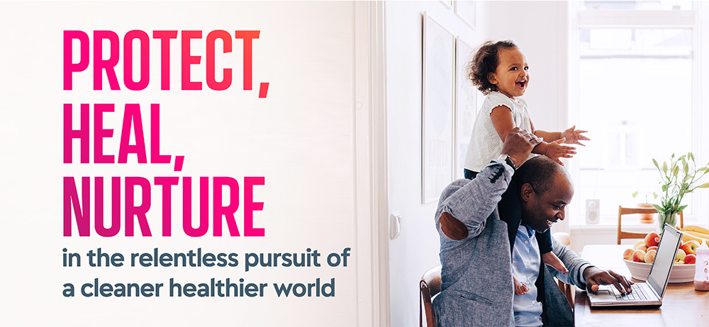
TO PROTECT, HEAL AND NURTURE IN THE RELENTLESS PURSUIT OF A CLEANER, HEALTHIER WORLD
The brand is a visible symbol of our corporate purpose and the change that has been taking place across the business on our journey of transformation. The name reflects the existing widespread usage of Reckitt and is clearer, simpler and more memorable, while retaining positive associations with the company’s heritage.
Miguel Veiga-Pestana
HEAD OF CORPORATE AFFAIRS & CHIEF SUSTAINABILITY OFFICER
Our new brand
Welcome to Reckitt
Our new name and visual identity symbolise this next stage in our journey, and enable us to tell the story of our heritage, our purpose, our fight and our compass with energy and impact.
Our new brand reflects our dynamism, speed and agility as a business, and our positive impact on people and the environment.
Our Logo
The R at the heart of the symbol stands for our unity, strength and relentless pursuit, inspired by Reckitt’s purpose to protect, heal and nurture. It denotes Reckitt’s role in the world as a partner and a catalyst for positive transformation. The shell-like quality of the symbol evokes a sense of protection and a reference to the natural world.
Our typography
Our ‘Energy Pink’ is a distinctive and recognisable primary brand colour. Our secondary colours are inspired by our brands and aligned to our purpose of a cleaner, healthier world.
Our colour palette
Our ‘Energy Pink’ is a distinctive and recognisable primary brand colour. Our secondary colours are inspired by our brands and aligned to our purpose of a cleaner, healthier world.
Our photography
New photography connects us with our communities and the environment and demonstrates the tangible impact Reckitt has on people’s lives, the strength of our partnerships and understanding of a changing world.
From Dettol to Lysol, Nurofen to Durex and Finish to Vanish, we sell more than 20 million of our trusted products to people every day, yet there is less recognition of the company behind those brands. Our new Reckitt identity will better enable us to communicate our corporate purpose to the world, and to do so in a way that is powerful, consistent and impactful.
Discover the latest from the Reckitt world and beyond. News and stories covering our brands, our people, social impact, investor news, innovation and more…